Gamma nodes at the strikes
One bar per strike: positive nodes slow price, negative nodes let it through.
What it shows
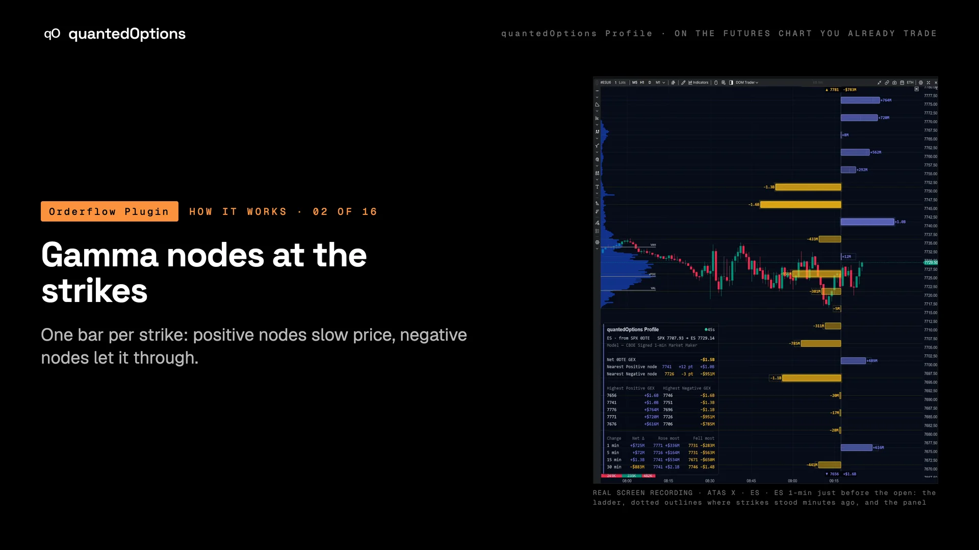
A ladder of bars on the right of the chart, one per strike, each drawn at the futures price of its strike. Positive gamma is always drawn to the right of the axis and negative to the left, and the length of a bar is the size of the exposure in dollars. The largest nodes are ranked and marked across the chart, with the call wall and the put wall labelled, and optional heatmap bands carry the strikes that matter across the chart.
What it is built from
On ES and MES each bar is the market maker's gamma exposure at that strike: licensed CBOE one-minute data with market-maker positioning, from SPX, computed and delivered every minute. On the other families the bars are computed from data consolidated across every US options exchange: open interest and volume.
Reading
How to read it
- A positive node is where market makers are long gamma: their hedging works against price there, so price slows or stops.
- A negative node is where market makers are short gamma: their hedging goes with price, so price moves through.
- The longest bar is the dominant node: in the case-study sessions it acted as the target and then the ceiling or floor.
- A large positive node directly beside a large negative one is a vertical (a spread): one strike bought by the market maker, the next sold.
- A hollow outline behind a bar is where that strike stood minutes ago: a bar longer than its outline grew.
Settings
What each setting does
| Setting | Options | What it changes |
|---|---|---|
| Heatmap | Off, Nearest + and - node, Top 3 each side, Top 5 each side, Strikes above 20 % of max, All strikes (default Off) | Draws bands across the chart at the chosen strikes, so the levels read without looking at the ladder. |
| Heatmap style / width / labels | Heat fade or Line; Full width, Right third, Right half; Price + value, Price, Value, None | How the bands look, how far they run and what each one prints at the axis end. |
| Value labels | All bars, Major bars, Off (default Major bars) | Which bars print their dollar value. |
| Bar width (% of chart) | percent | The longest bar as a share of the chart width. |
| Ladder position (% across the chart) | 0-100 (default 100) | 100 sits the ladder against the right edge; lower slides it left. |
| Hollow comparison bars | on / off (default off) | A hollow bar where each strike was N minutes ago, beside the solid one. |
| Outline the 3 strikes that changed most | on / off (default off) | A bright outline on the three biggest movers in the first change window. |
| Glow on the largest bars | on / off (default on) | A soft glow on the biggest bars. |
| Hover tooltip on bars | on / off (default off) | A strike's numbers when the mouse is over its bar. |
Read it with
- SPX Strike Profile — the same ladder on the dashboard, with every expiry beside it
- The data panel — the nearest node each side and the top five, as numbers
- The live ATM straddle band (±1) — a node at a band edge is two readings at one price
Good to know
- Gamma is largest near the money and near expiry, so a node grows as price approaches it and as the close approaches.
- Bars are as tall as the strike spacing allows; zoomed in they become hairlines at the exact price.
- With the ladder off, the heatmap bands carry the levels on their own.
On a real chart
See it happen
13:38 ET
One dominant node: SPX 7700 prints on the ES chart at 7704.50 at 10:07 and 7705.25 at 13:38, where it peaks at +$17.92B. No candle trades at SPX 7700 from 10:07 to 14:47. Point at the single long positive bar above price.
11 slides
The walk-through, slide by slide
Slide 1 / 11
These pages describe what the displays show and what the data did on the sessions shown. They are not trading advice, and a past session is not a forecast of a future one.